Refills Reimagined
A multi-year overhaul of Walgreens’ digital prescription hub produced incredible results
13 million users refill and manage prescriptions on the Walgreens website every month. As constant user advocates, we strove to increase the site’s simplicity and usefulness. The refill hub brings in $4 billion in annual revenue, so updates required thorough research and testing. In-lab prototype evaluations, online survey data, and A/B testing informed our decisions.
Results
4% conversion lift ($180 million annual revenue increase)
10% customer satisfaction score gain
50% reduction in page load time
01
Goals & Timeline
I worked closely with the product manager to define goals and key UX/UI principles:
Increase conversion & customer satisfaction score
Achieve best-in-class web design
Simplify interaction & visual design
Keep user within page for key tasks
Align creative with other business lines
After defining the project scope, we created a rough timeline:
02
Self & Competitive Analysis
The previous hub design needed help; my UX counterpart and I put together a list of possible improvements. We then studied direct competitors (CVS, Target, Walmart, etc.) and top-ranked e-commerce sites to compile trends and inspiration. Here are a few highlights:
Previous issues
Dated, unresponsive table design
Cluttered page layout
Unclear UI elements
Inconsistent copy
Competitive analysis Insights
Group info using card patterns
Remove excess info & add white space
Create adaptive sort & filter options
Consider sticky call-to-action bar
03
Initial Concept Evaluation
We created three testing concepts based on our analysis. Each had varying degrees of styling and information density as well as different interactions which we asked users about during in-house usability testing. Ultimately, users preferred the heft of the card layout option over the picture-forward or minimalist versions.
04
Information Density Research
Finding the sweet spot between simple and useful was very important to users. Based on results from the first round of testing, I explored cards with varying density levels to evaluate usability and readability. We ran an online survey of 241 pharmacy participants and showed them the different card designs, then asked:
Which information must you have at a glance on your Rx cards?
Only 6 of the 15 data points we asked about had at least 50% of users answering that they must have them at a glance. We determined that these were the data points we’d include on the final card designs and placed secondary information behind detail links or moved to other contextual locations.
05
Rebranding
While I was working on the prescription hub redesign, Walgreens was looking to modernize the brand. We convinced our DVP to assemble a SWAT team from our in-house group to take a stab at it and in 2 short weeks we presented 3 brand-centric options, something the external agency couldn’t do in 3 months. After final approval, I helped create brand guidelines for both print and digital use.
Established tone, photography style, and design systems
Formed personas based on key demographics
Tested new look & feel across platforms
06
Digital System Rollout
I led the UI team in stress testing the new brand guidelines across various pages (pharmacy, retail, site marketing, long-form content, etc.) that would use the system. We then determined what worked—and what didn’t—in the digital space.
Established web-accessible and compliant components
Designed a cloud-based Sketch library with responsive symbols
Created a coded live style guide to share assets with developers
Aligned team to a single source of truth as styles evolved
Select UI components
07
Initial Redesign Launch
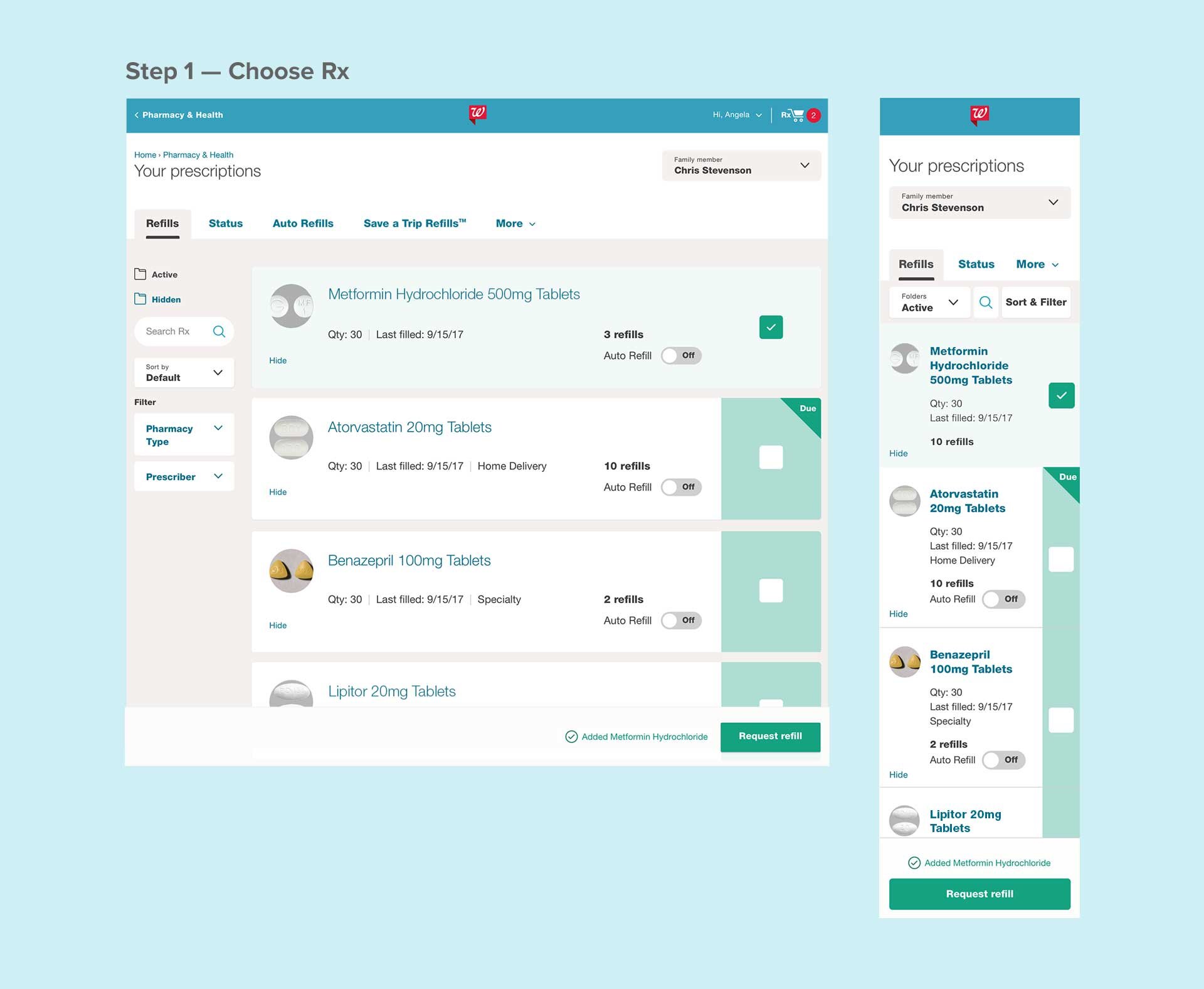
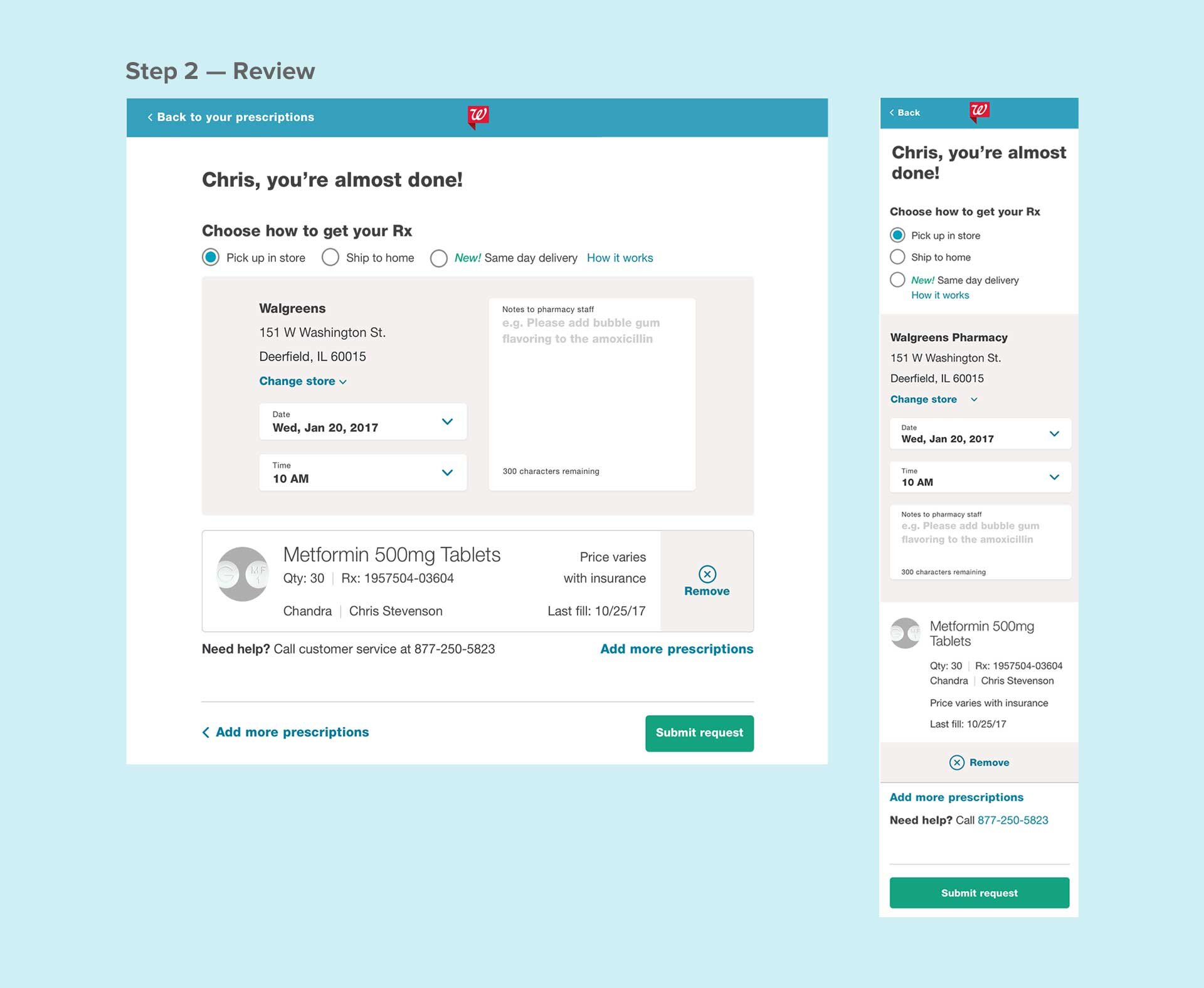
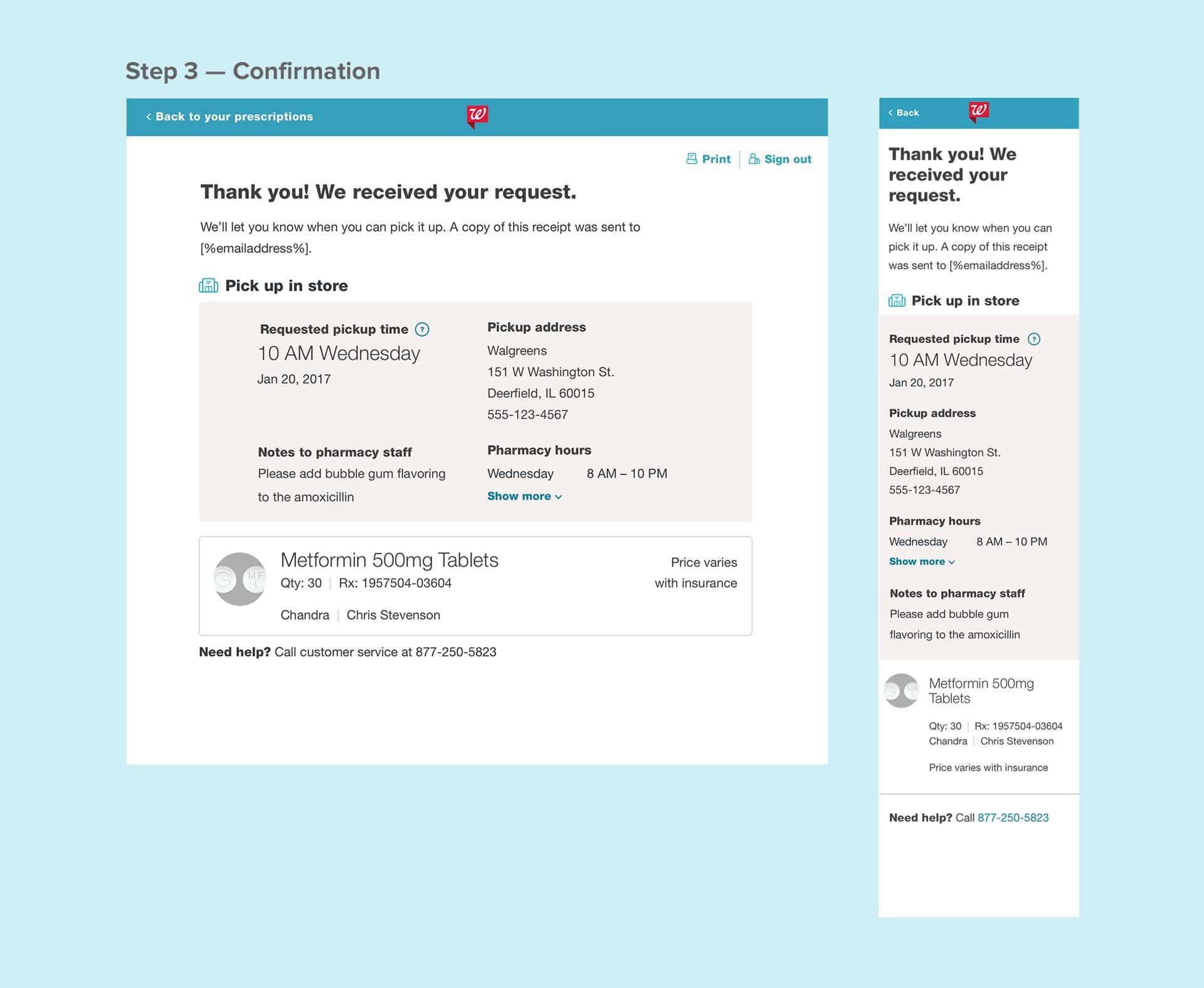
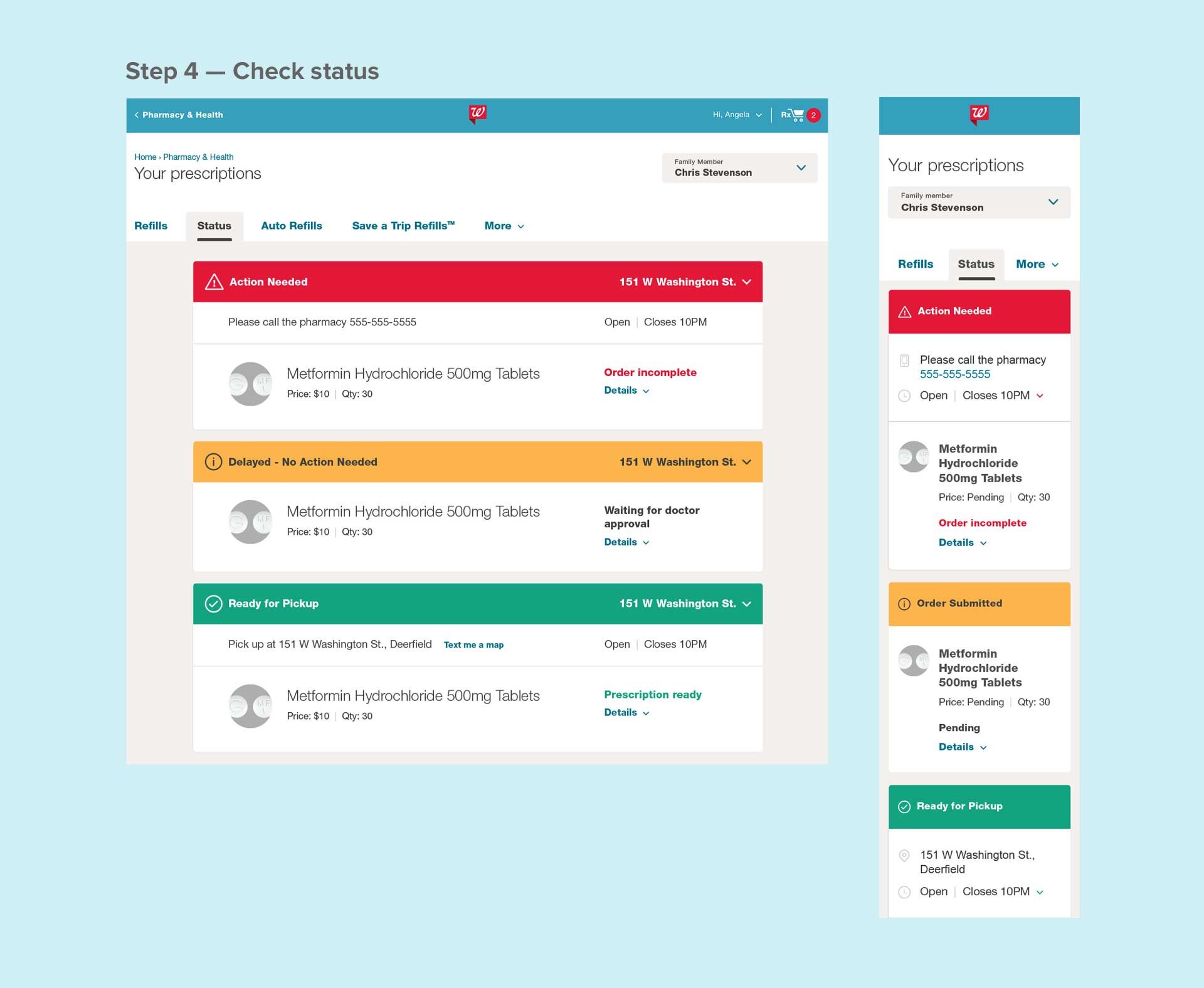
The refill process began as a cumbersome 7 step flow; we simplified it to just 3 steps—with an optional 4th to check status.
Decreased page load time with reorganized layout
Enhanced readability with larger fonts & less clutter
Reused card modules throughout flow
Promoted additional pharmacy services after order placement
Improved status comprehension with new color system
08
Optimizations
After the redesign launched, we used data to continue optimizing the hub.
Auto Refill Toggle
Auto-refilling medication is proven to increase adherence… if users know about it! I proposed and implemented a new UI component—a simple on/off switch—which streamlined a multi-step process and improved visibility.
60% bump in total enrollment
$17 million/month revenue increase
Mobile Optimization
The initial redesign increased desktop conversion by 4%, but mobile web conversion lagged behind at 1.5%. Through research and testing, we identified improvements and deployed a new design that increased mobile conversion.
Lean Header
We minimized distraction by replacing the standard global header with a lean pharmacy-focused version that helped users focus on the refill task.
Rx mini cart
Data informed us that a small percentage of users edited information on the review page before submitting an order. This backed up our decision to shorten the flow by introducing one-click refilling to the main prescription page. The mini cart provided links for users who needed to edit the default pickup details or still wanted to see the full review page.
09
Holistic Order Status
Although there can always be additional improvements, the latest version is the accumulation of all our learnings over several years. We streamlined the refill process even further by combining order status with the main prescriptions page so the user could have a more holistic view of all prescription states.
Added color-coded details to separate status cards
Progressively disclosed info to avoid clutter
De-emphasized folders and sort & filter based on low usage
Improved family management and navigation for caregivers
10
Refill Drivers
All of these updates are great, but don’t mean much if we don’t help users get to them! We simplified our refill reminder email from a 2-step process to one click, increasing order conversion 20% ($400 million/year). We also implemented SMS refill reminders—simply reply to refill.


