Drug Info Overhaul
An enhanced content portal with an increased ease of discoverability
We revamped the Drug Information section of the Walgreens site to achieve the following goals:
Increase customer traffic & satisfaction
Provide best-in-class drug info as a trusted major retail pharmacy source
Generate revenue by promoting refills and partnering with external clients
01
User Flows & Wireframes
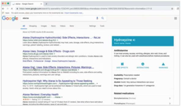
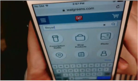
One of the main goals of this project was taking a holistic look at how users navigate to the drug information page. There were several routes the user could take to get to the page and we discovered via data analytics that users usually landed on the page after searching for a specific drug on Google or via the global search bar on the Walgreens website.
I worked with a UX designer to put together high-level wireframes that contained all of the different kinds of information we wanted to include on the page and included documentation for how different components on the page should behave.
02
Research
We ran an online survey of 65 users to gain insights about how people look for drug information and what they’d hope to find on the page.
“I sometimes forget that [Walgreens] would be a resource for me. I’ve been so used to Googling everything that I don’t think...here’s a good, vetted resource for me to use.”
Finding drug info
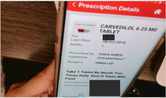
We asked participants to demonstrate how they typically find information about a specific drug online.
Most started their search with Google and clicked through to well-known resources like WebMD
Participants generally did not think of a pharmacy website/app as a place to find drug info
Many preferred the Walgreens drug info page over other pharmacy sites and popular resources
“When I first get prescriptions, I typically have questions. Side effects are the biggest one.”
What users looked for
We asked users what kinds of data they want on a page like this and ranked feedback to determine content prioritization. We also used a heat map to see which areas of the page were most important.
Desired drug information
Heat map
One of the most valuable takeaways from our research was discovering how important side effects are to patients. After we confirmed that this was by far the most important element for our users, we decided to emphasize this area of the page. Our team worked on a partnership with Patients Like Me, a third-party company that showcases user-provided feedback via various charts and graphs. We then used their API to embed that information on our page and styled it with our brand guidelines.


